Just shy of its 100 year birthday, the refresh of this M-Streets Tudor built in 1926 fell into our laps. Renovating old homes is always special. The walls hold stories that new homes do not, and we love honoring those memories.

The first step throughout was to prepare the home to be painted, patching all cracks and nicks and signs of age. That prep alone took 2 weeks! When it was time to paint we chose Sherwin Williams Natural Linen for the walls in most downstairs rooms and common areas. Labradorite from Sherwin Williams was chosen for the front door. We added a pop of color with the sofa and layered in natural shades to replace the Venetian blinds that had seen better days. The rug was existing and with a cleaning from Oriental Rugs on Ross Avenue (which has been there about as long as this house!) it was restored to its beautiful colors.
Our client loves color (as do we) so you will see our color palette unfold as we go from room to room!

After testing lots of green paint colors, we landed on Gallery Green from SW for the dining room walls. Our amazing refinisher brought the client's family heirloom dining table and chairs back their original glow, and we grouped antiques from other areas of the home in this room, creating a bar with a beautiful burlwood piece. We did not want a formal stuffy space, so to counteract the browns and formality, we used a fun Thibaut fabric for the drapery, a casual sisal rug and a clean simple chandelier.

Moving into the breakfast nook...we know a good banquette spot when we see one! And the bonus is all the extra storage under the seats! Old homes do NOT have storage and clutter control is a huge part of making a home shine. We used the Thibaut pillow fabric here to inspire our cottage-y colors. The bistro chairs were our client's great-grandmother's. They are perfect in a new coat of coral paint (after the MANY colors they had been over the years - see below!!). And the new cafe curtains let the pretty sunlight filter in for morning coffee vibes.

Piping detail gave a little punch to the striped cushions, and you can see where the seat lifts up for that storage (we specifically measured to make sure the air fryer would fit inside!).
The before...it was time! PRIMARY BEDROOM
Upstairs we had our biggest challenge. The primary bedroom had very tiny closets that cut into the room and threw the windows off center. And the function of the room was the most troublesome. We were determined to give our client a peaceful and functional room, and adding storage was crucial.
Here is what we came up with. A nice windowseat on the left with three big drawers was perfect in the niche that was there. Then we removed the closet that was in the upper right corner and had wardrobes and a dresser made for the opposite wall.

Tada!

The spot under the windows was begging for a window seat, and the drawers under it added lots of storage. We painted the walls one of our favorite colors - Sherwin Williams Opaline. It works so well as a "neutral" with brighter colors and also with natural more neutral finishes.

These wardrobes have hanging space, a scarf pullout and shoe pulluts making them uber-functional. We managed to "hide" the TV in the little nook between the wardrobes and the built-in dresser added more intentional storage. Painting all of these pieces in the same white as our trim color gave us a cohesive look, making the 216 SF bedroom feel much larger.


We added drapery behind the bed with a beautiful cornice that we re-purposed from another client. We hate waste, and it was easy to cut this down and recover it to our liking. And that headboard was originally brown - we had it repainted in the bright green.
Now back downstairs! This family room was an add on to the original structure. Our clients wanted this area to work as a place for family to all gather to watch sports and movies with comfortable seating for everyone. Do you recognize any of these pieces from other rooms above? We used the antique pieces in the dining room and front living room, after having them repaired and re-finished.

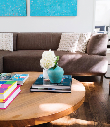
I think our clients were worried when we chose the neutral paint color, but they had faith and we delivered on color! The custom original art from Addison Sloane (check out her work at Talulah and Hess) really pulled it all together, don't you think? Fun swivels in sunny yellow add punch, and the table behind the sofa has stools under it, adding more seating for game watching or "TV dinners"!
Last but not least! We had a little bathroom challenge! The tiny downstairs bath is under the staircase and therefore a unique shape. It was impossible to make a shower curtain work, and we loved the fun blue mosaic tile. After a few tries, the team at Wise Glass came up with a folding door that still allowed you to enter the shower (accordian was the key!) and we left a little opening for turning the water on to get it hot. Addison Sloane came through with art from her stunning Refractions series, echoing the square tiles.
This was truly our favorite project this year. Full of challenges and problem-solving, with wonderful clients partnering with us throughout the process. This old house has hosted many a Greenville Avenue parade party, book club meeting, PTA get together and so many family memories. We were honored to take her into her next era.


Comments